Why the IPCC’s First Assessment Report over-estimated forcing since 1990
Introduction
In this article I want to offer a detailed calculation of the radiative forcing projected by the IPCC in its First Assessment Report (FAR), published in 1990. I will then compare the numbers with a modern estimate of forcing to understand why the IPCC’s projection diverged from reality.
A crude attempt to do this calculation can be seen in this previous article, as well as this one. To save time and words, in the current article I will not explain any definition that has been given in the previous two. So I really recommend that you read them in order to avoid confusion.
This will be my last article on the issue of the IPCC’s First Assessment Report — at least the specific topic of its forcing projections. If there are corrections or changes, I will include them by updating this article.
This article was published on March 10th, 2020. The latest update was on March 18th, 2020.
Forcing according to the IPCC’s First Assessment Report
FAR used four forcing scenarios, A through D. Scenario A was also called ‘Business as usual’, and it’s the one I’ll deal with in this article.
Here’s a panel from the report’s Figure 2.4. From bottom to top the different forcings are: CO2, methane (CH4), nitrous oxide (N2O), CFC-11, CFC-12, HCFC-22, and stratospheric water vapor. Notice that, according to the report, “the gas referred to as HCFC-22 as given in the scenarios is used as a surrogate for all the CFC substitutes”. All CFCs, HCFCs and substitutes are halogenated gases, or halogens for short.
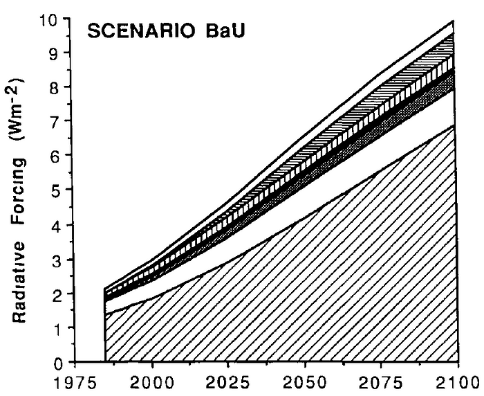
The numbers in Figure 2.4 agree with those of Table 2.7: total forcing is just under 3W/m2 by year 2000, and a bit below 10W/m2 by the end of the XXI century.

Unfortunately, the IPCC did not disclose forcing values for each year. However, one can estimate forcing by year 2018, 2019, etc. by extrapolating. For example: from a 2000 baseline, forcing by 2018 can be estimated as 72% of forcing by 2025 (because 18 / 25 = 0.72). There is a very slight accelerating trend in the forcing numbers, which means that a linear extrapolation will over-estimate a little, since over the early part of the period growth in forcing was not as fast as in the latter part. But this problem is minor, given that the “early part of the period” in fact makes up most of the period in question.
(I’m going to compare the IPCC’s forcing numbers with those of Lewis & Curry 2018. Since that paper has data up to 2016, I will try to calculate IPCC forcings from 1990 until that year).
One could also digitize the top line of Figure 2.4, the one that depicts total forcing. However, I’ve found it impossible to accurately digitize each individual forcing; the lines are just too close to each other, and the area of the chart that we’re looking at is very small. Since this article requires knowing the increase in each forcing, extrapolation is the only method that works in practice. By doing it with each forcing and then aggregating, one reaches an estimate of 1.050W/m2 forcing from 2000 to 2016; the result is virtually the same if one extrapolates from the sum of forcings.
Now, we also have to calculate forcing between 1990 and 2000, which turns out to be more tricky. Take a look at Table 2.6. It does not feature HCFC-22, which is understandable as this forcing was almost non-existent by 1990 (even by year 2000 it was supposed to reach only 0.04W/m2). But it does feature a column for “Other CFCs”, which doesn’t appear in Table 2.7.

The sum of all featured forcings does in fact match the “Sum” column, both for Table 2.6 and 2.7. But one category of forcings disappears from one table to the next. What’s going on?
My hypothesis is that the IPCC featured these “Other CFCs” for estimates of historical forcing, but not for projections of future forcing. It’s easy to see that the “Sum” of forcings increased by 0.5W/m2 when comparing both tables (from 2.45 to 2.95 W/m2). But if you look at the increases in each forcing and then add them up, even without including HCFC-22, you get a higher figure. The only possible explanation is that Other CFCs were in fact dropped from post-1990 forcing estimates.
So in order to calculate forcing between 1990 and 2000 I look at all the elements of Table 2.6 except for Other CFCs. In the case of HCFC-22, I assume forcing in the IPCC’s projection increased by 0.03W/m2 between these years. In all, this would mean forcing of 0.578W/m2 from 1990 to 2000; total forcing from 1990 to 2016 would increase by 1.628W/m2.
A small mystery regarding total forcing in the First Assessment Report
There are two figures in the IPCC’s report, 6 and A.6, which show total forcing both in the historical period and for future projections; the figures are essentially identical. Here’s A.6:

My belief is that these figures were included in prominent sections of the report for illustrative purposes, but do not represent the forcing inputs used in the IPCC’s climate model. To be clear, this is speculation; I just assume the more detailed chart is the one that shows the forcings actually used to create the IPCC’s projections of climate change.
It turns out there is a small discrepancy between the two sources. In previous articles I analyzed a paper by Zeke Hausfather; while I criticized some aspects of the paper, I do have to say its digitizing is very good and provides consistent values. Well, it turns out that Hausfather calculated total forcing from FAR by digitizing Figures 6 and A.6; the exact numbers are here.
From 2000 on, there is almost perfect agreement between total forcing growth as per Hausfather’s digitization and my extrapolation; my method estimates 0.004W/m2 more than Hausfather’s but, as mentioned earlier, a minimal over-estimate is to be expected from a linear extrapolation. On the other hand, between 1990 and 2000 Hausfather reports forcing of 0.511W/m2, which is less than the 0.578W/m2 I estimated in the previous section. Remember that Other CFCs constituted 0.085W/m2 of forcing in 1990 (Table 2.6), and did not feature at all in estimates of forcing by year 2000 (Table 2.7). Hausfather’s estimate, which is to say the forcing depicted by Figures 6 and A.6, is approximately the forcing growth one would get if one included Other CFCs at the beginning of the period but not at the end.
So it seems that Figures 6 and A.6 use some sort of visual kludge to shift from historical, up-to-1990 forcing (when Other CFCs were included) to post-1990 forcing (when they were not). That’s why they show less forcing growth between 1990 and 2000 than Figure 2.4 and Tables 2.6 and 2.7.
It’s impossible to know exactly what the IPCC did. But I believe, based on the evidence presented above, that Figure 2.4 and Table 2.7 provide the real forcing projections of the IPCC’s First Assessment Report. In any case the difference is not major.
Nature of the differences between IPCC forcing projections and reality
Before diving into the numbers it’s useful to remember the situation with each of the forcing agents considered in FAR:
· The error in CO2 forcing is plainly a scientific issue. The world appears to have emitted greater quantities of this gas than per FAR’s Scenario A, but the latter ended up over-estimating concentrations because it massively over-estimated the fraction of emissions that would remain in the atmosphere (60–62% versus 44% or so in reality). Another way to put this is that, even if the IPCC’s model had had a correct transient sensitivity to CO2 forcing, it would have over-estimated the temperature increase from CO2 emissions by 35–40% — because the increase in CO2 concentrations that it projected, per unit of CO2 emitted, was far too large.
· If one measures forcing in raw W/m2 the problem is exacerbated: FAR expected forcing from an increase in CO2 concentrations to be 15% larger than the current estimate. So, for a given amount of CO2 emissions, it over-estimates forcing by 55–60% (the result of multiplying 1.35 or 1.40 by 1.15).
· Stratospheric water vapor is not directly emitted by humanity. Rather, it is created through the decay of methane. For this reason, I attribute the error in this forcing to errors in projections of methane concentrations. There may have been additional issues with the IPCC’s projection, because it expected forcing from stratospheric water vapor to grow slightly faster than that of methane, whereas according to LC18’s numbers it was the opposite.
· In the case of halogenated gases, their concentration increased much more slowly than the IPCC expected. The Montreal Protocol was implemented more quickly and thoroughly than FAR’s “Business as usual” envisioned. This cannot be considered a scientific mistake.
· The case of N2O is less clear, but this gas played a small role in both IPCC projections and reality
I want to offer a more elaborate explanation of methane. Estimates of methane emissions are uncertain, even today; just a few weeks ago a paper found that emissions from fossil fuels may be much larger than previously believed. FAR reflected this uncertainty in its Table 1.2:
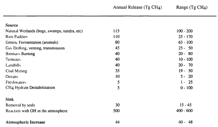
Expressed in words, FAR had only a crude notion of how much methane humanity was releasing, and even less idea of how much each source of this gas contributed. There were also major quantitative doubts about the natural factors that remove methane, i.e. the sinks.
A comparison with CO2 using approximate numbers will illustrate the difference. At the time of FAR’s publication the stock of CO2, i.e. its atmospheric concentration, was about 350 parts per million (ppm). With CO2 emissions from fossil fuel combustion of about 2.5 ppm per year, and an uncertainty interval of roughly 0.25ppm on each side, the total uncertainty in CO2 emissions from fossil fuels equaled about 0.14% of the amount of CO2 in the atmosphere. CO2 emissions from land use were more uncertain but made up a small part of total emissions.
By contrast, the stock of methane at the time of FAR was about 4,700 teragrams. The uncertainty from rice emissions alone was equivalent to 3% of the stock of methane. No wonder the IPCC had a hard time forecasting methane concentrations.
Thus, one could say that FAR over-estimated the emissions of both methane and halogens since 1990, and that this is the reason these two forcings were over-estimated. But the nature of the errors is very different. In the case of halogens, FAR had a very good idea of emissions at the time; it also knew how long emissions would remain in the atmosphere, and was thus able to calculate concentrations from emissions. Finally, it knew the forcing that a given concentration of the different halogenated gases would cause. The IPCC over-projected future halogen forcing because it failed to foresee the decline in halogen emissions as a result of mitigation efforts, and scientists can’t be faulted for that.
On the other hand, the IPCC had almost no idea of what processes were going to release how much methane into the atmosphere, and there were (as now) major uncertainties about the processes that remove methane from the atmosphere, as well as possible release of methane due to warming feedbacks (e.g. melting permafrost). Still nowadays, the reason why methane concentration growth slowed down since 1990 is unclear. So the IPCC’s error in projecting methane concentrations was fundamentally scientific.
This was partly offset by other error: FAR’s formula resulted in less forcing for a given amount of methane, compared with modern estimates. As a result FAR “only” over-estimated methane forcing four-fold, whereas in terms of concentration growth its projection was 5–6 times greater than reality.
And now let’s do the math.
Results
Wait, shouldn’t there be a section called “forcing according to Lewis & Curry 2018”? Well, there’s no need for a whole section on that, because the paper is quite explicit in what it counts and how it counts. The main problem is that LC18 aggregated the forcing of several greenhouse gases, so in order to compare its results with the IPCC’s you needed to break them down; that was done in this previous article.
LC18 provides raw forcing numbers, but also suggests two adjustments to reflect the different efficacies of volcanic forcing and black carbon on snow: the former should be cut approximately in half, and the latter should be multiplied by three. Here I report the results both with the adjusted and unadjusted LC18 data.
Another issue, which formed the basis of this other article, is the amount of forcing given by a doubling of CO2 concentration (F_2x); this value is not the same in all studies. Specifically, FAR assumed F_2x was 4.37W/m2, while in LC18 this value was 3.80 W/m2 (actually a more complex formula, but in practice almost exactly that number). If one is trying to calculate climate sensitivity, then one should look at changes in forcing not in absolute W/m2, but as a percentage of F_2x. However, for other metrics such as sea level rise and ocean heat uptake the more relevant metric is absolute W/m2. So I’m going to report the differences between LC18 and FAR both in raw W/m2 and as a percentage of F_2x.
When compared with LC18’s unadjusted data, the IPCC’s First Assessment Report over-estimated forcing by 0.568W/m2; expressed as a percentage of F_2x, the difference is 0.094. That is to say: FAR’s Scenario A expected forcing equivalent to 0.094 more doublings of CO2 than LC18 reported. CO2, methane and stratospheric water vapor accounted for 96% of the over-estimate in raw W/m2 and 105% when measured as a share of F_2x.
LC18’s adjusted data shows a smaller forcing increase between 1990 and 2016: 1.021W/m2. Therefore, there is a bigger gap between LC18 and FAR forcing (0.607W/m2 and 0.104 times F_2x). However, the sum of CO2, methane and stratospheric water vapor still accounts for almost all of the difference: 90% when measured in raw W/m2, and 94% when measured as a share of F_2x.
In short: scientific errors accounted for the entirety of the over-estimate in the IPCC’s forcing projection.
This conclusion is reinforced when you consider that the IPCC did not account for ozone forcing. Now, LC18 did include ozone, both stratospheric and tropospheric. For the former, forcing was almost zero over the 1990–2016 period; there was some negative forcing until approximately 2000, but the decline in CFCs meant that in the XXI century this effect has mostly reversed. The reason is that halogens used as CFC replacements cause a comparable greenhouse forcing but far less ozone depletion, or no ozone depletion at all.
However, if atmospheric concentration of CFCs had kept rising as FAR’s Business-as-usual scenario projected, then stratospheric ozone forcing would have been greater. Although the exact amount is unknown, one can make some estimates. From 1970 to 2000, approximately one-sixth of the greenhouse forcing from halogens was offset by the negative forcing caused by stratospheric ozone depletion. Since there is a gap of 0.158W/m2 between real-world halogen forcing (1990 to 2016) and FAR’s projection, then the latter should also have included 0.025 or 0.03W/m2 of negative forcing from stratospheric ozone.
Another way to express the paragraph above: FAR’s projection was unrealistic or inconsistent, because it assumed very strong forcing from CFCs and other halogens without accounting for their effect on stratospheric ozone (which is the reason CFCs were phased out in the first place). Including this effect would have made total forcing growth over 1990–2016 about 0.025 or 0.03W/m2 smaller. Therefore the share of forcing error explained by CO2, methane and stratospheric water vapor would have been even greater, by 4–5%.
And what about halogens themselves? They played a major role in the divergence between IPCC projections and reality, accounting for 26–28% of the error in FAR’s forcing forecast when measured in W/m2 and 32–36% when measured as a share of F_2x. The gross error across CO2, methane, stratospheric water vapor, halogens and N2O is well in excess of 100%. But there was also a countervailing error due to forcings that IPCC didn’t account for, which mostly have had a warming effect since 1990; the main ones are trospospheric ozone and aerosols. Although the latter constitute a negative forcing, their atmospheric concentration has declined since 1990, so if you start to count from that year they have produced a positive forcing.
Coincidentally, the error in the IPCC’s estimate of forcing from halogens is roughly the same as the forcings it omitted. That is to say: the positive forcing that the IPCC projected from halogens (but didn’t happen) is about as big the forcing it omitted from other factors (but did happen). That’s why more or less all of the net error in its forcing projection can be explained without halogens.
More evidence that the First Assessment Report under-estimated CO2 emissions
In the first article in this series I used estimates of CO2 emissions from BP’s Energy Review and the Lawrence Berkeley National Laboratory. Both were incomplete in some manner and I had to use home-made adjustments, so going forward I will rely instead on the Global Carbon Project, which seems are more rigorous source.
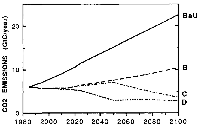
According to my digitization of FAR’s Figure A.2(a), available in the link above, over 1991–2016 the IPCC projected emissions of 217 gigatons of carbon (GtC). In comparison, according to the Global Carbon Project actual emissions were 238.69 GtC. While the uncertainty around land-use emissions does not allow one to definitively state real-world emissions have been higher than forecasted by the IPCC, that’s the conclusion all sources I’ve seen so far point to. As with halogens, this cannot be considered a scientific mistake. But if the IPCC had projected the right amount of CO2 emissions, its over-estimate of forcing from CO2 would have been even greater.
Furthermore, the Global Carbon Project reports that the increase in CO2 concentrations from 1990 to 2016 was equivalent to 104.90 GtC, which means the airborne fraction was 44%. While the reason the IPCC’s projected airborne fraction diverged so much from reality is a mystery, one can say the issue does not appear to have been caused by an error in baseline emissions. On page 13, FAR reported the airborne fraction over 1980–89 at 48%, though with a confidence interval ranging from 40 to 56%. The fraction reported by the Global Carbon Project for these years is actually higher, about 51%.
So the IPCC expected the airborne fraction to increase strongly since the 1980s, but in reality it appears to have declined.
Conclusion
In the first article about the topic I said that two issues accounted for “the bulk of the error” in the IPCC’s forcing projection, and both mistakes were due to limitations or mistakes of physical science. Specifically, the problems were:
· The airborne fraction of CO2 projected by the IPCC, over 60%, was far higher than in reality
· The projection of methane concentratios was very inaccurate. Although methane concentrations did increase in the real world, the growth projected by the First Assessment Report was five or six times larger.
The assessment of the original article was a bit speculative but has turned out to be correct. Inaccuracies related to CO2 and methane forcing account for all or almost all the error in the IPCC’s forcing projection if one measures forcing in relative terms (i.e. as a share of the forcing that arises from a doubling of CO2 concentrations, or F_2x). The IPCC also over-estimated forcing by stratospheric water vapor, but that’s a by-product of methane.
If one measures forcing in absolute terms, i.e. in W/m2, there is a third factor: the First Assessment Report expected a doubling of CO2 to result in 4.37W/m2 of forcing whereas the modern estimate is 3.8W/m2. Nevertheless, this is a scientific error as well. If you’re going to quibble that all estimates are wrong, at least you’ll agree that FAR’s estimate was wronger, based on what we know now.
The Montreal Protocol contributed to the over-estimate of forcing in FAR, because emissions of halogenated gases were reduced much more quickly than the IPCC expected. But this effect was offset by other factors, such as rising tropospheric ozone and declining aerosols, that have resulted in a positive forcing since 1990 and were not included in the IPCC’s calculations. If the IPCC hadn’t made the mistakes it made about CO2 and methane, its projection of radiative forcing would have been almost exactly in line with modern estimates, regardless of the Montreal Protocol.
Data
· The IPCC’s First Assessment Report, Working Group 1, is here
· The Lewis & Curry 2018 paper is here. The Reply to a Comment, which includes the code used to calculate forcings, is here.
· The Global Carbon Project offers the data I used. However, it seems the actual data is not available on their website; instead I found it in the ICOS Carbon Portal. The specific file I used is this one. I thank Nicholas Lewis for pointing out this source of data.
· My own spreadsheet with all the calculations is here.

